Branding
Digital Design
Turning light and motion into a cinematic identity.
( 00-01 )
ABOUT THE PROJECT
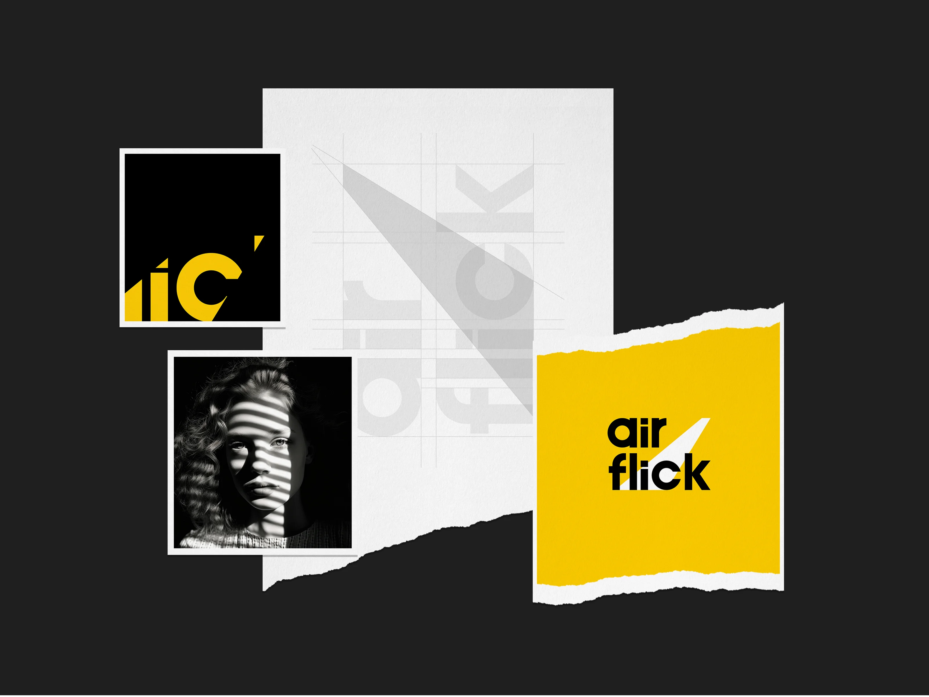
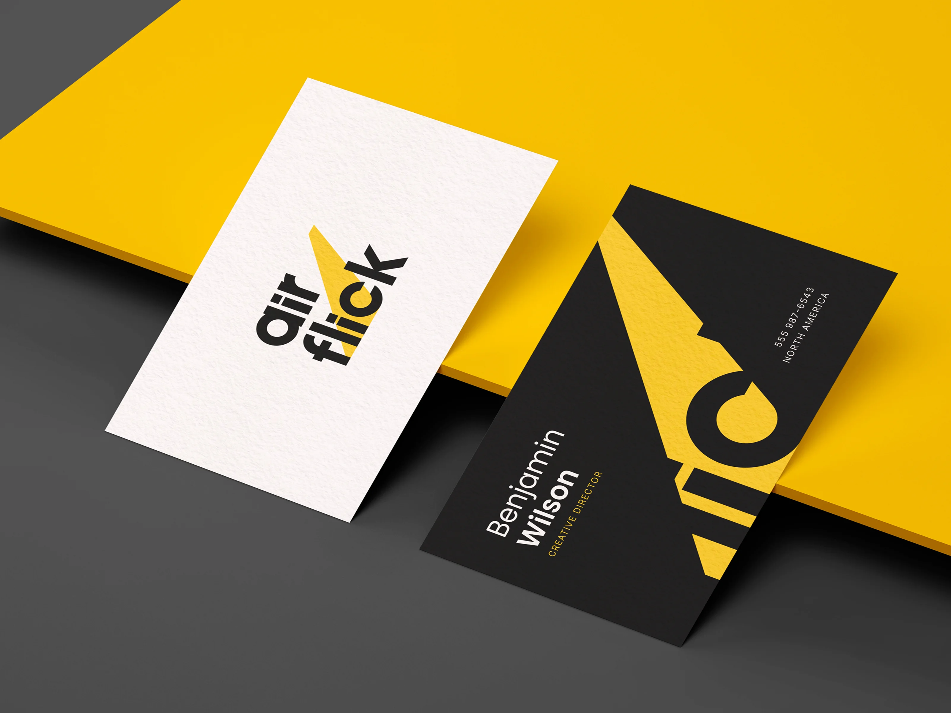
AirFlick Studios came to us looking for a brand that could capture the energy of cinema without falling into familiar film-industry clichés. The challenge was to turn two abstract ideas, “Air” and “Flick,” into something distinctive, memorable, and visually ownable.
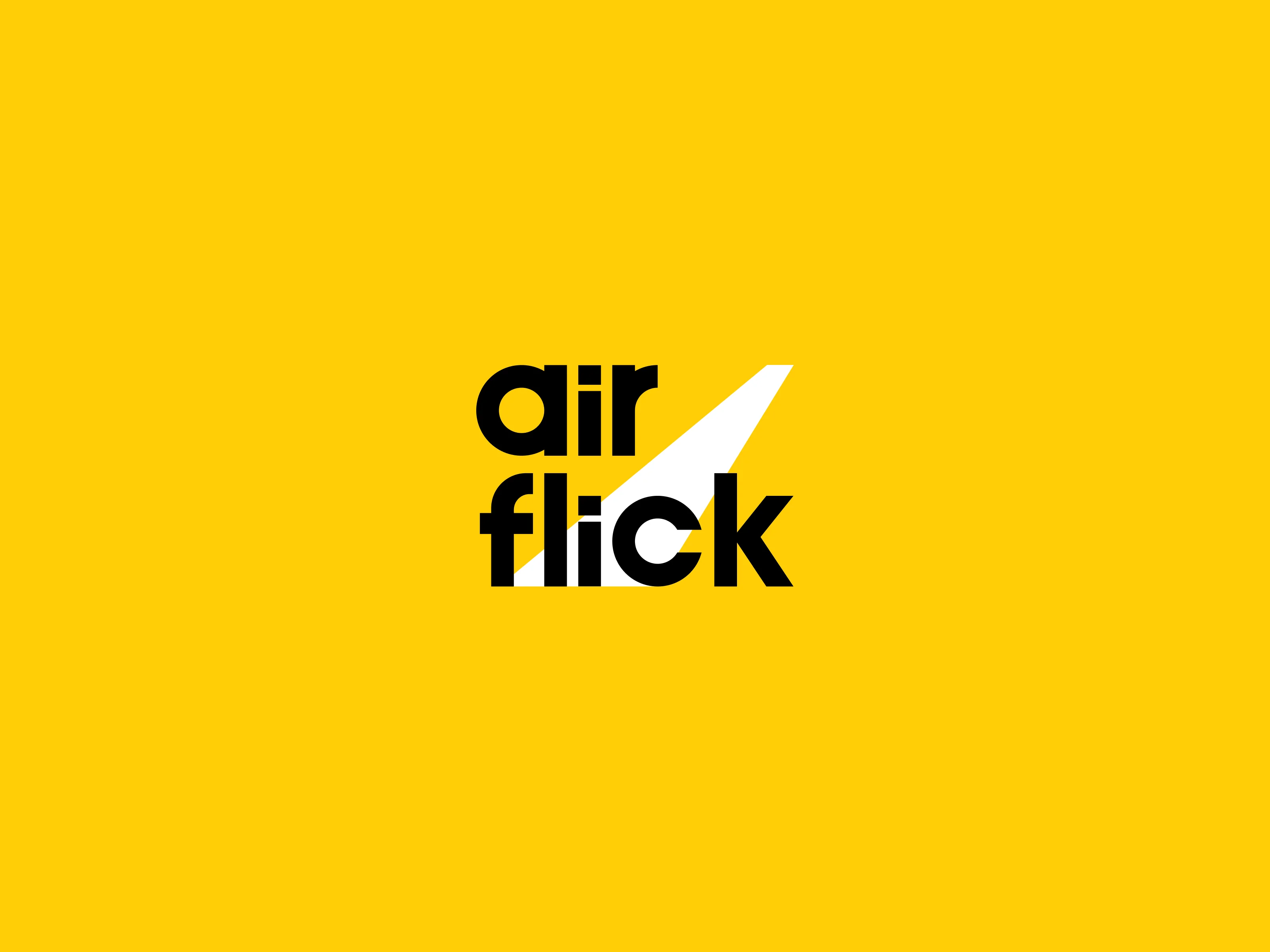
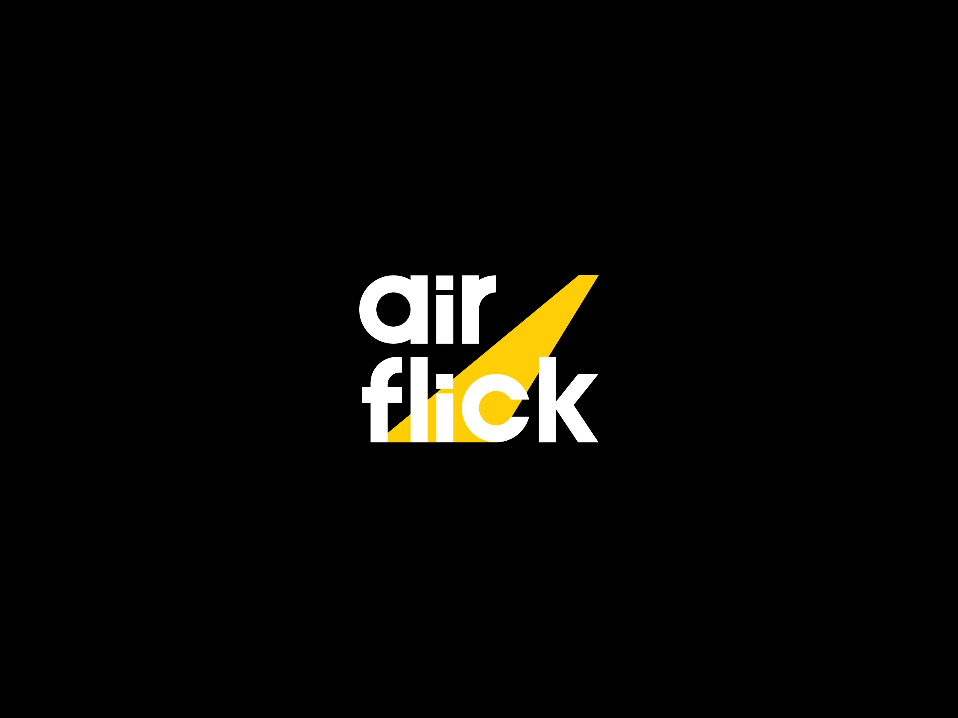
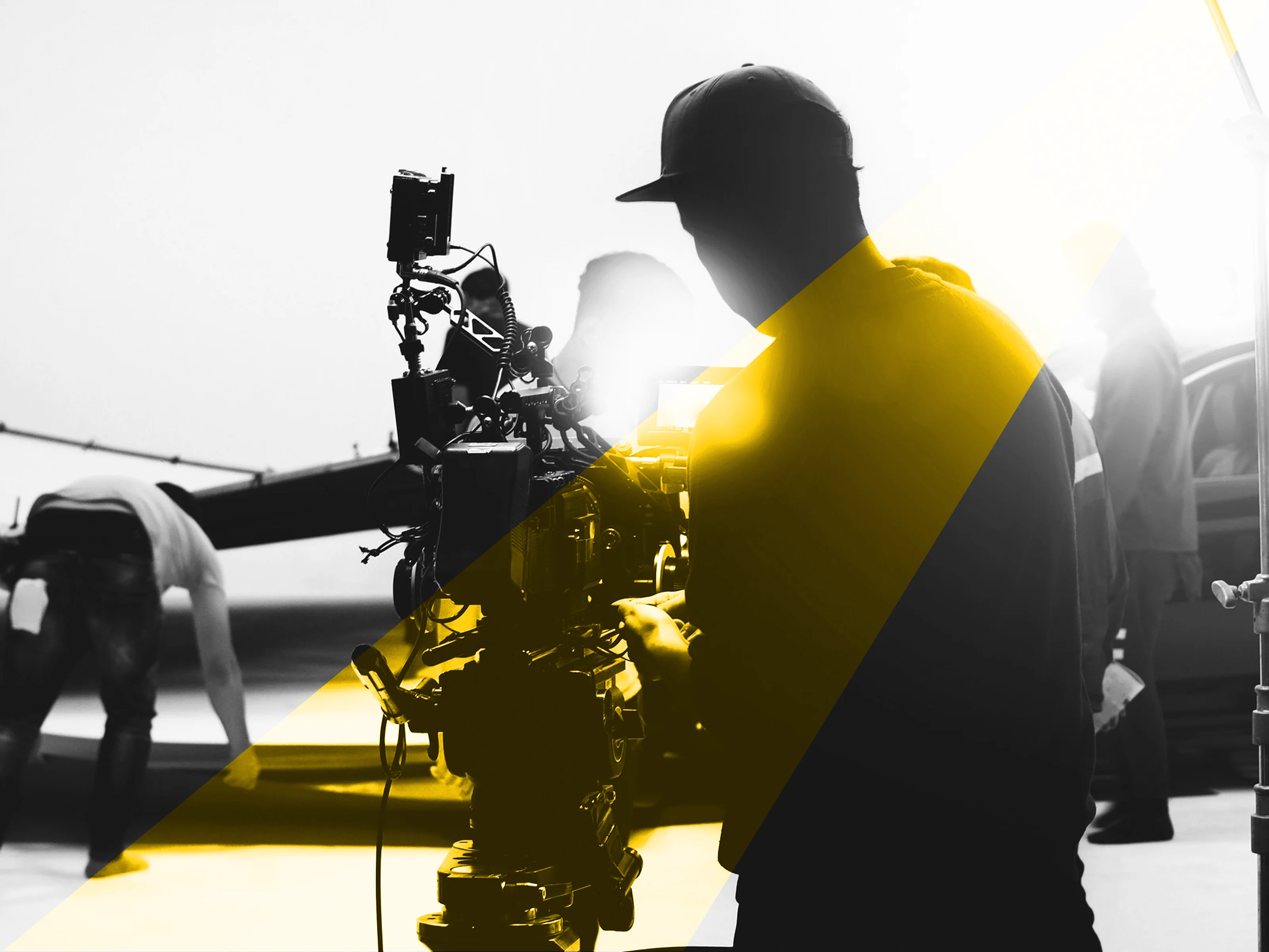
We built the identity around light, movement, and cinematic contrast. Rather than relying on cameras, reels, or play icons, the visual language uses motion and illuminated forms to create a brand that feels expressive, contemporary, and unmistakably connected to film.


( 00-02 )
CHALLENGES
The hardest part was making an abstract idea feel immediate. “Air” has no fixed form, while “Flick” suggests speed, movement, and cinema. The identity needed to connect both ideas without becoming literal or predictable.
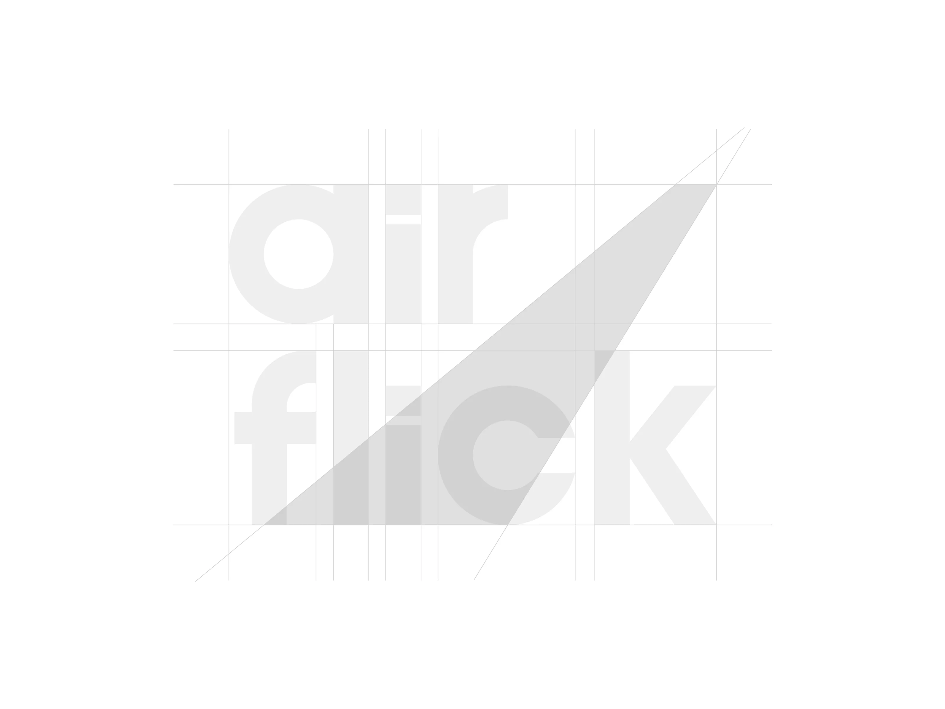
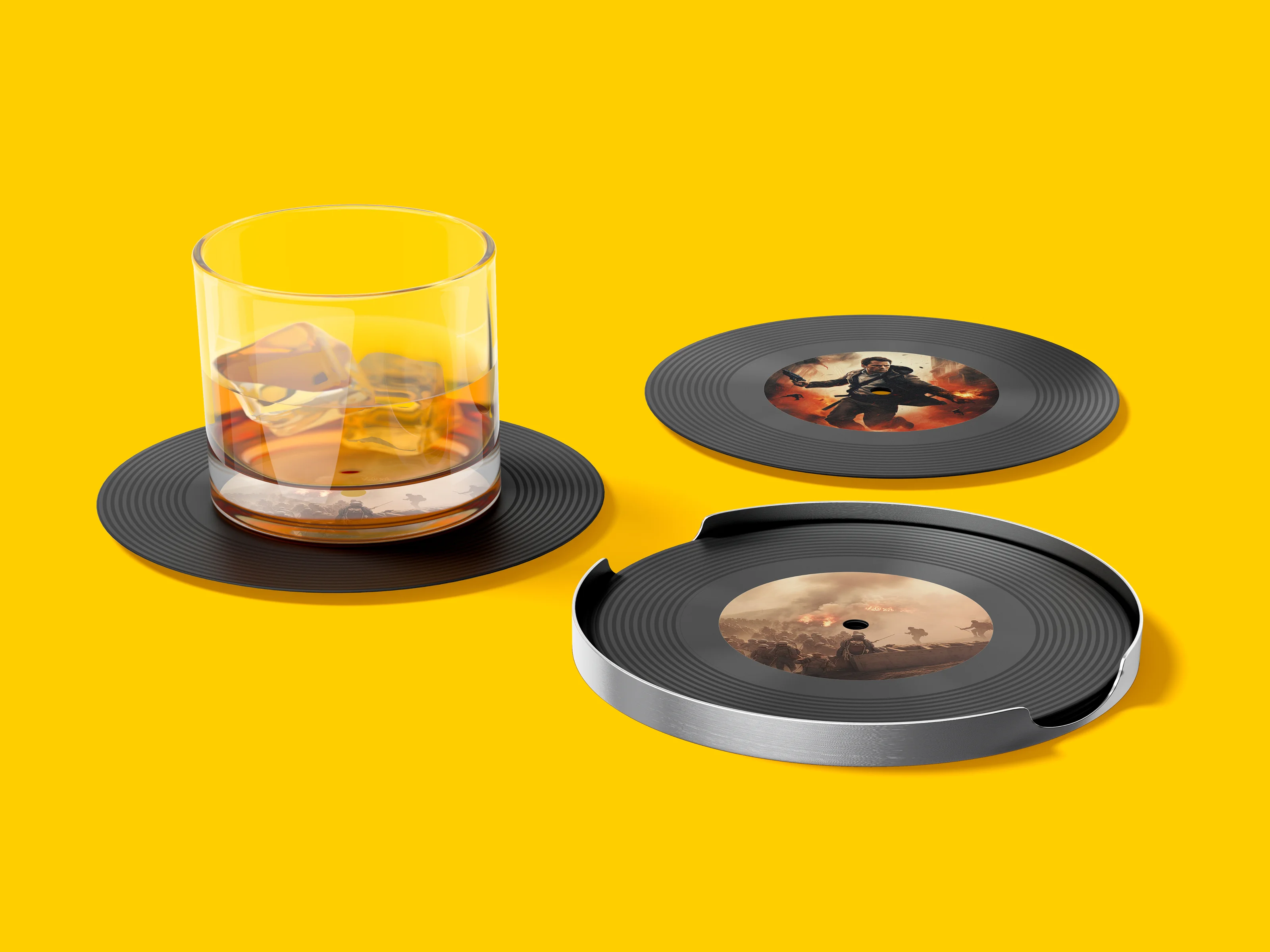
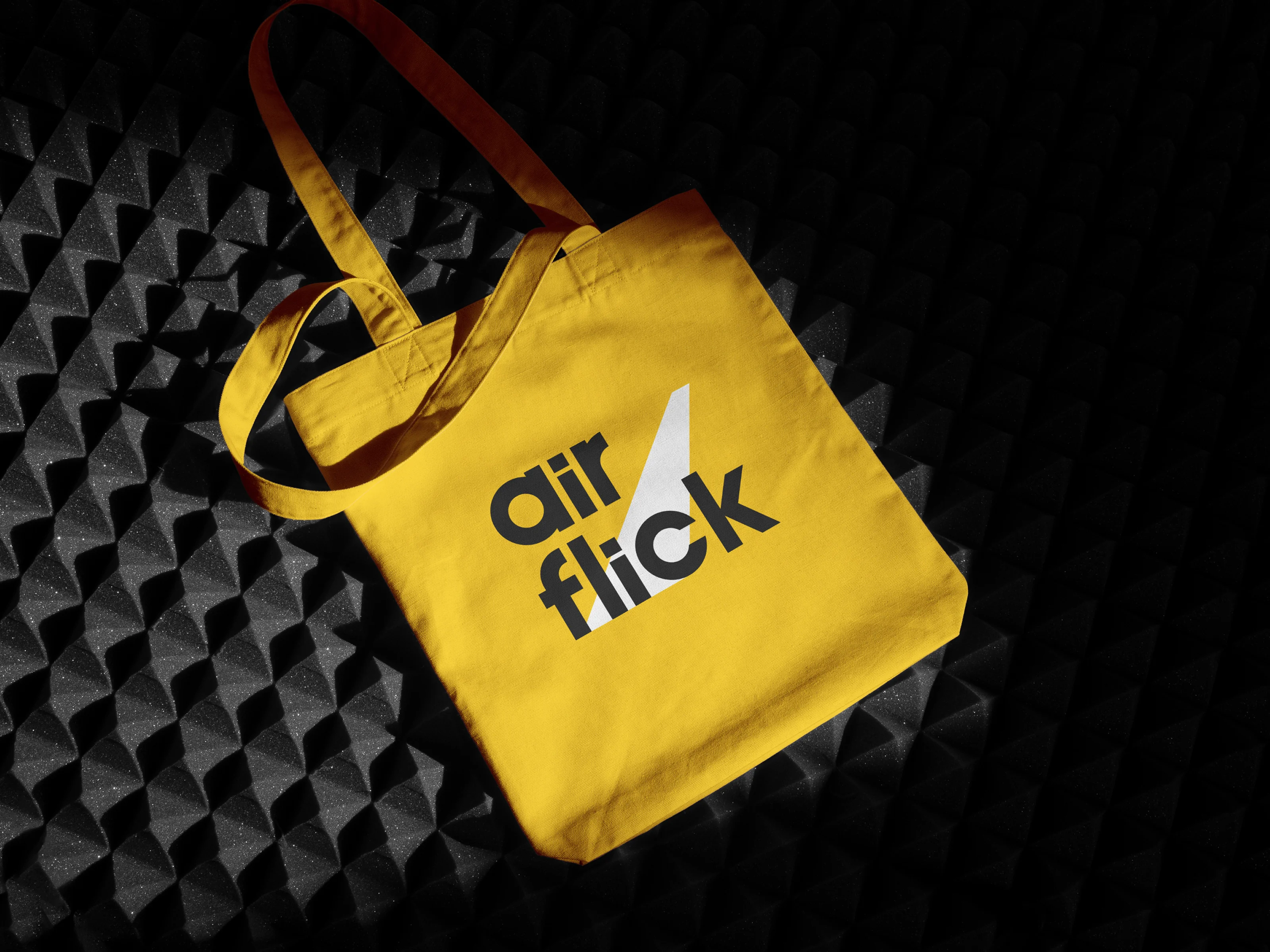
We reduced the concept to a simple visual principle: light in motion. That idea guided the wordmark, compositions, motion behaviour, and supporting graphics, giving AirFlick a system that could move naturally across screens, presentations, promotional material, and production touchpoints.



( 00-03 )
SUMMARY
The first direction connected with the client immediately and gave AirFlick a stronger, more confident presence to take into conversations with investors and collaborators.
The result is a cinematic identity built around movement rather than convention. A distinctive wordmark, flexible visual language, and motion-led system give AirFlick a brand that can stay recognisable across both static and moving applications.
( 00-03 )
DISCOVER MORE