( 00-01 )
ABOUT THE PROJECT
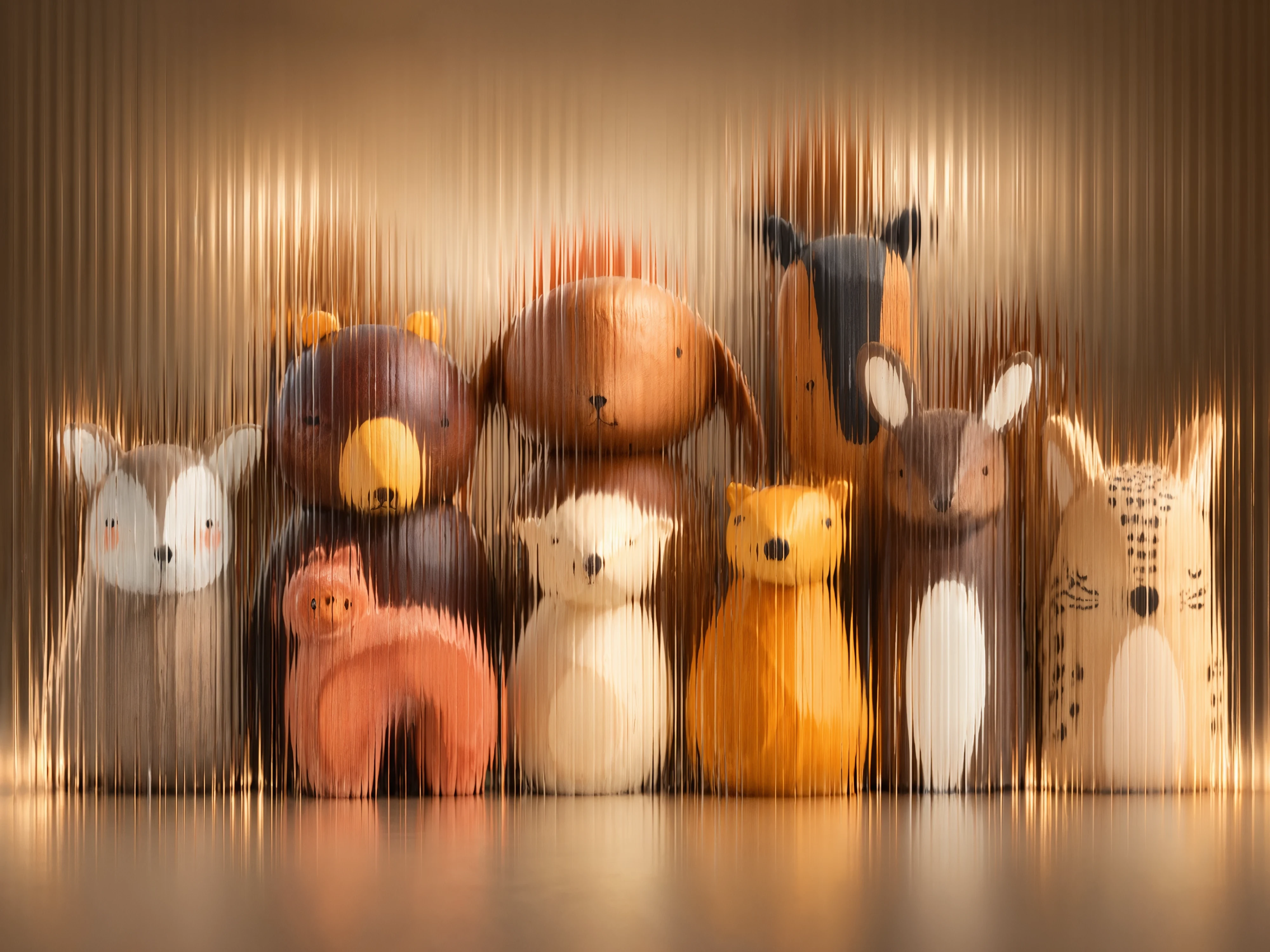
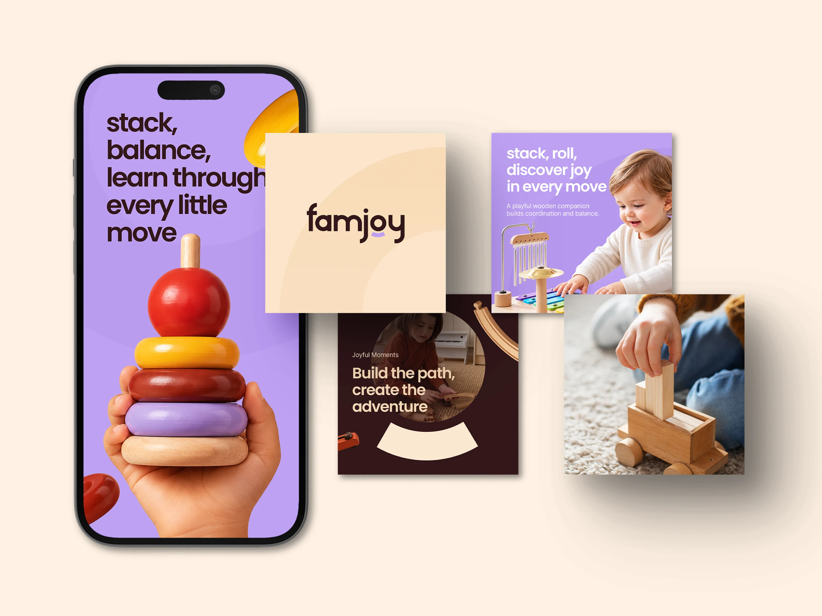
FamJoy set out to make wooden toys feel fun, warm, and trusted by young families. But it needed more than a logo. It needed a clear brand with charm for kids, confidence for parents, and enough range to work across packs, social posts, print, and future new products.
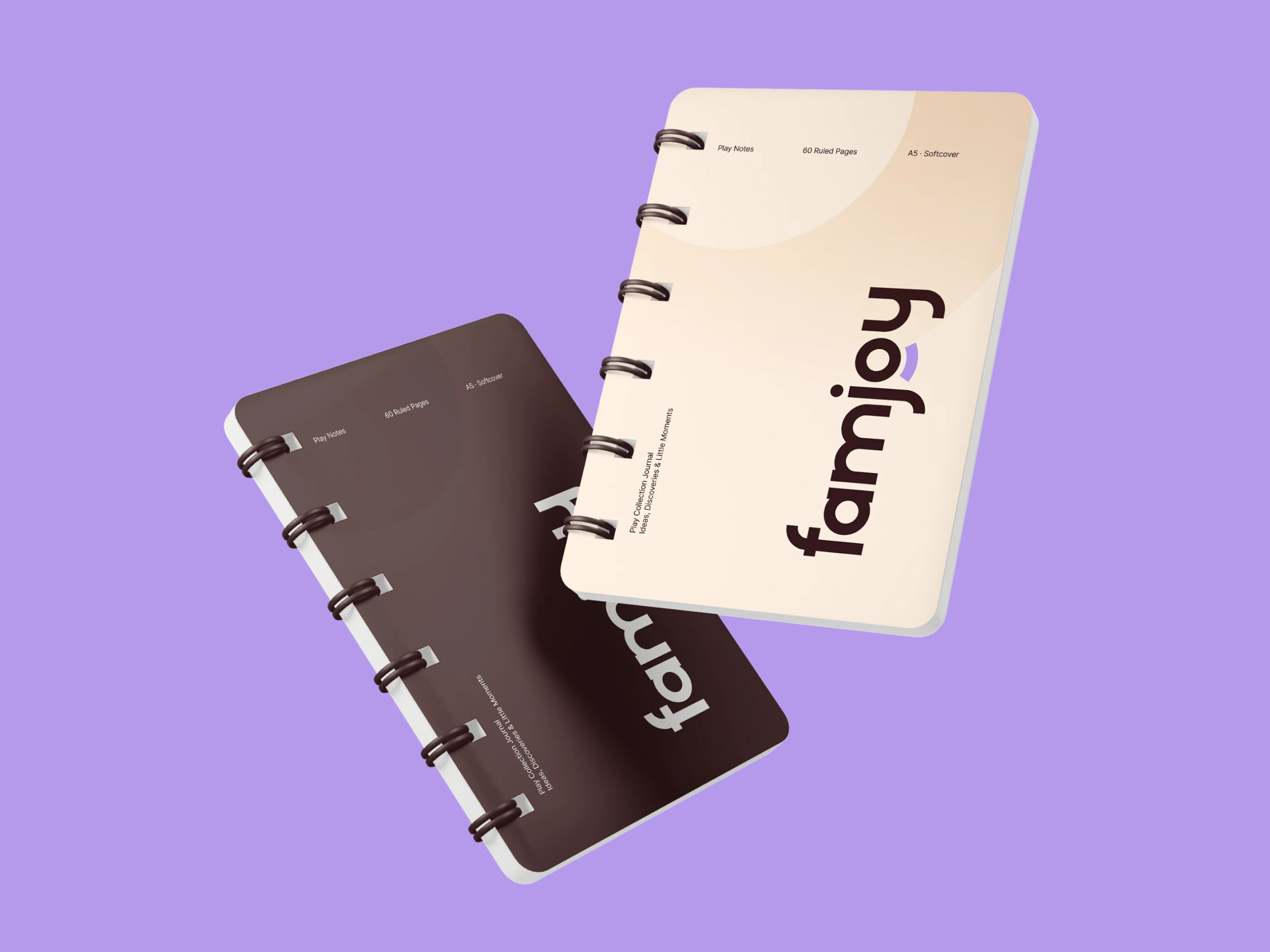
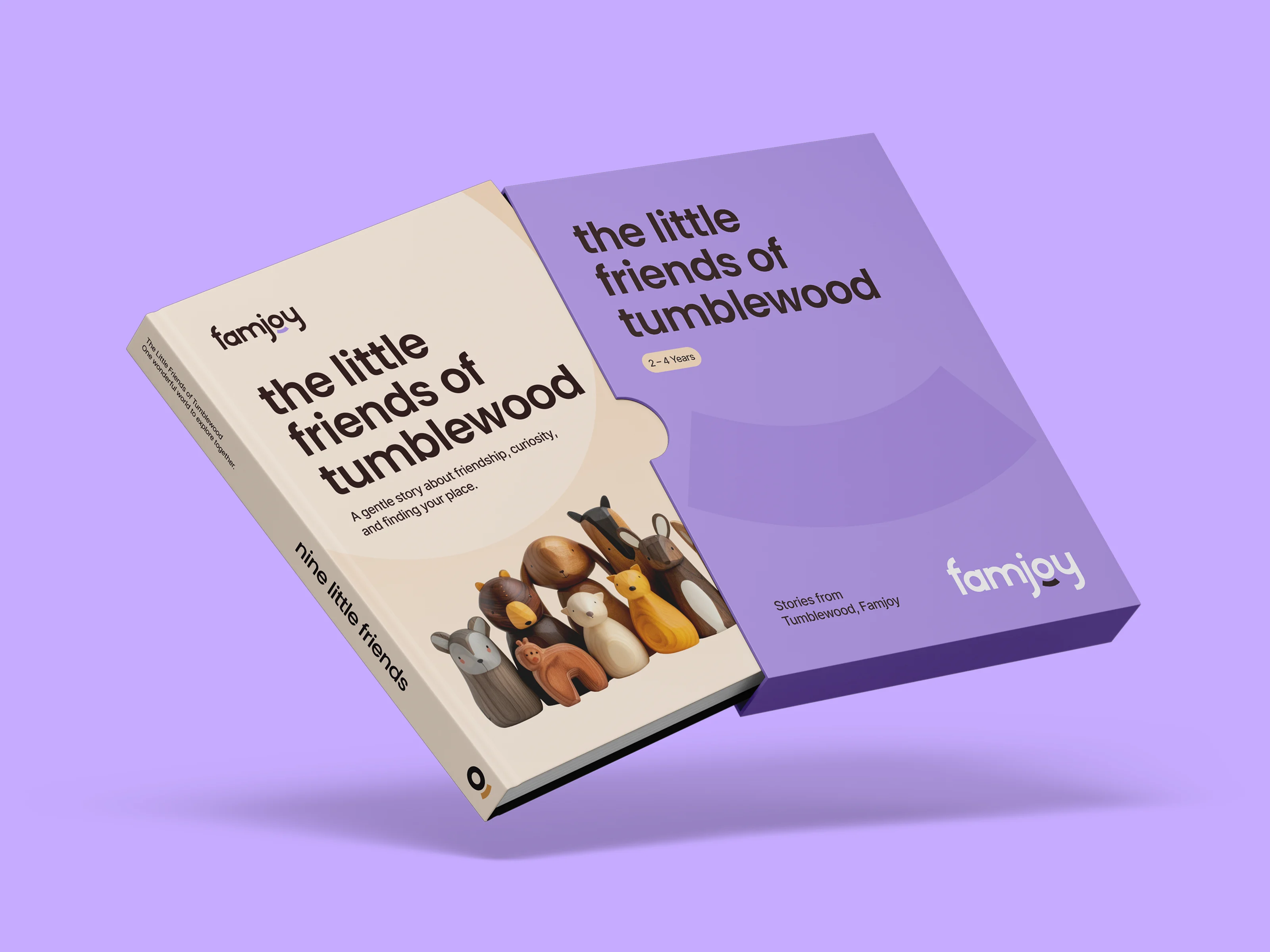
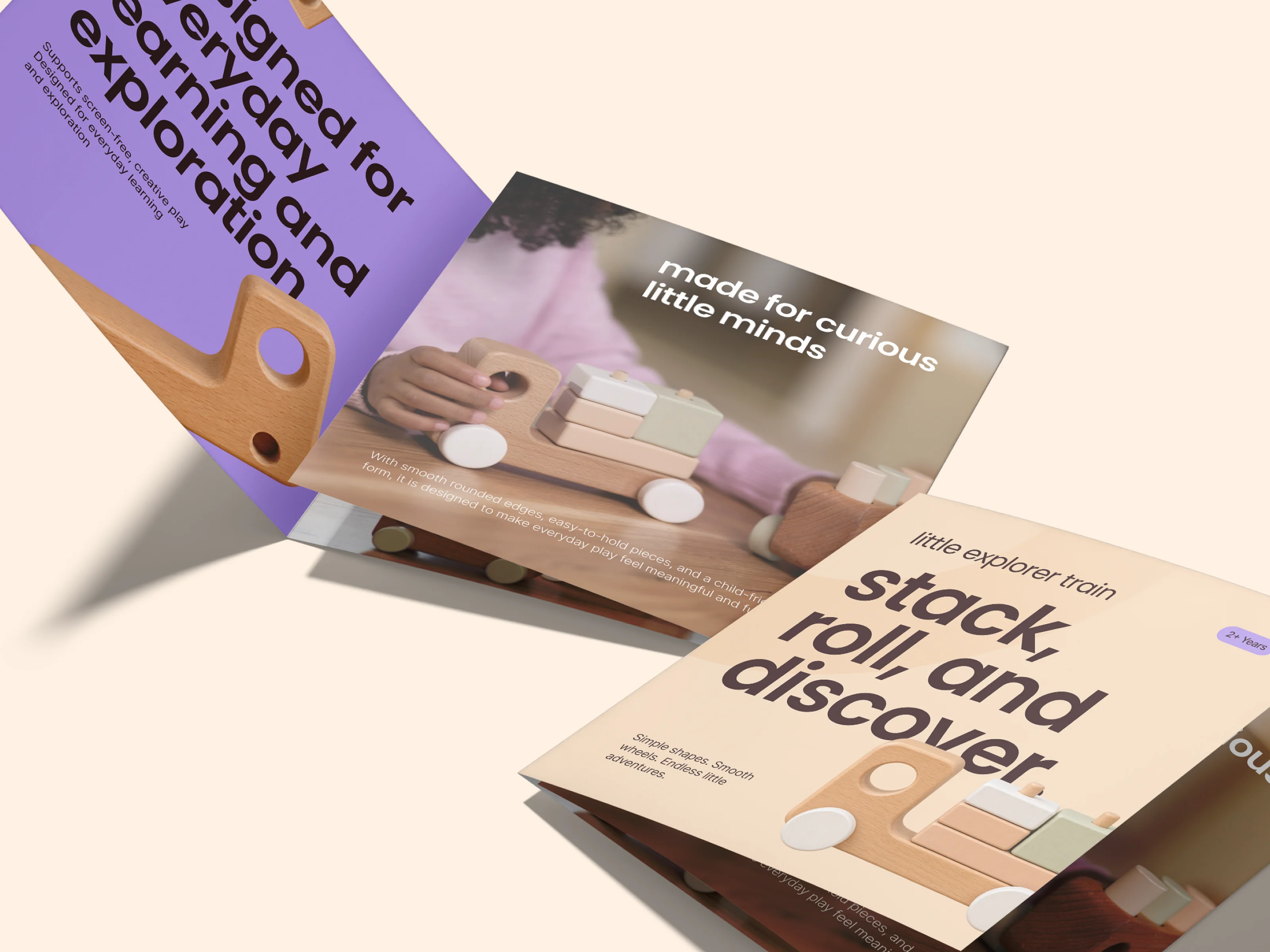
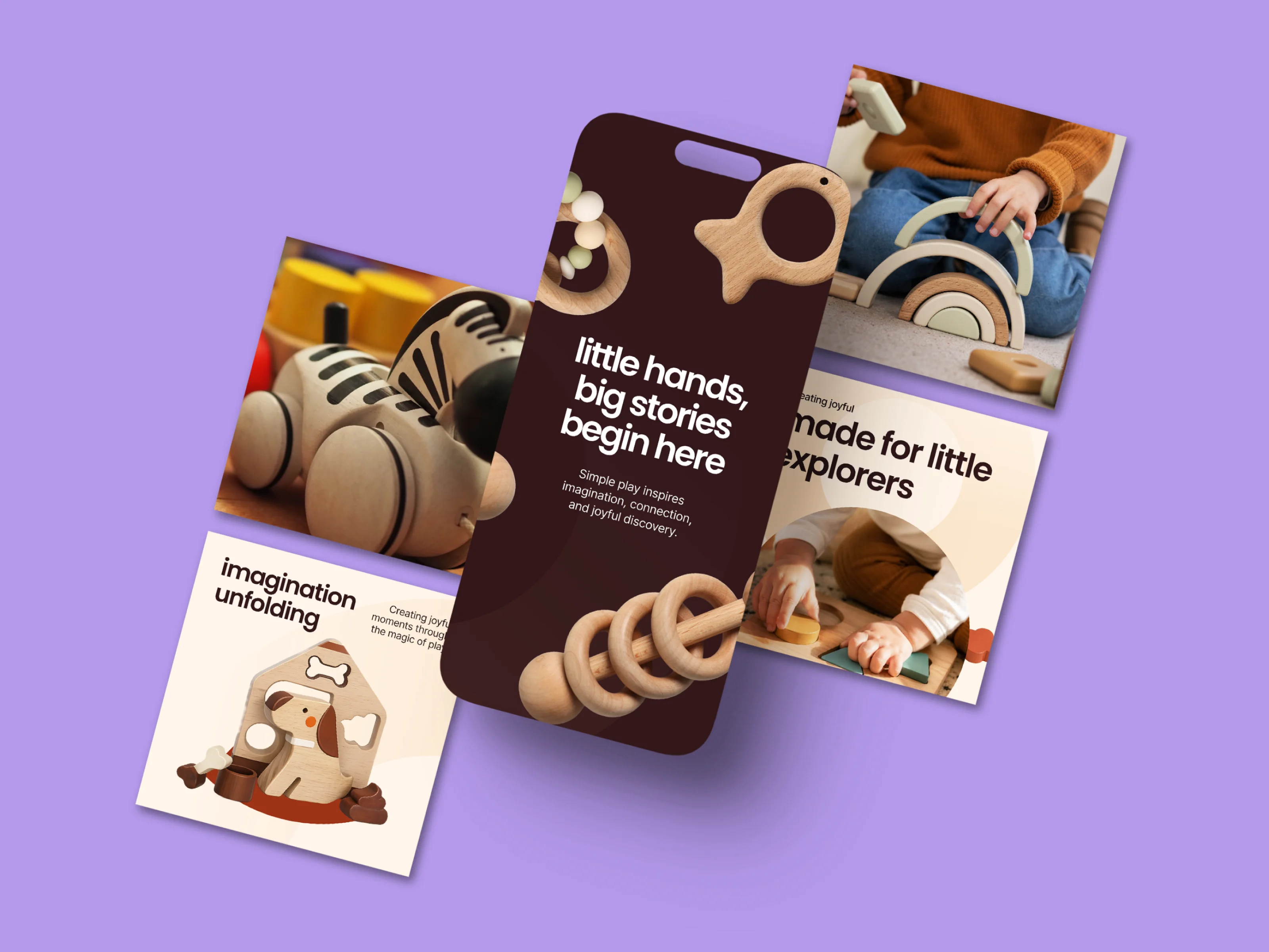
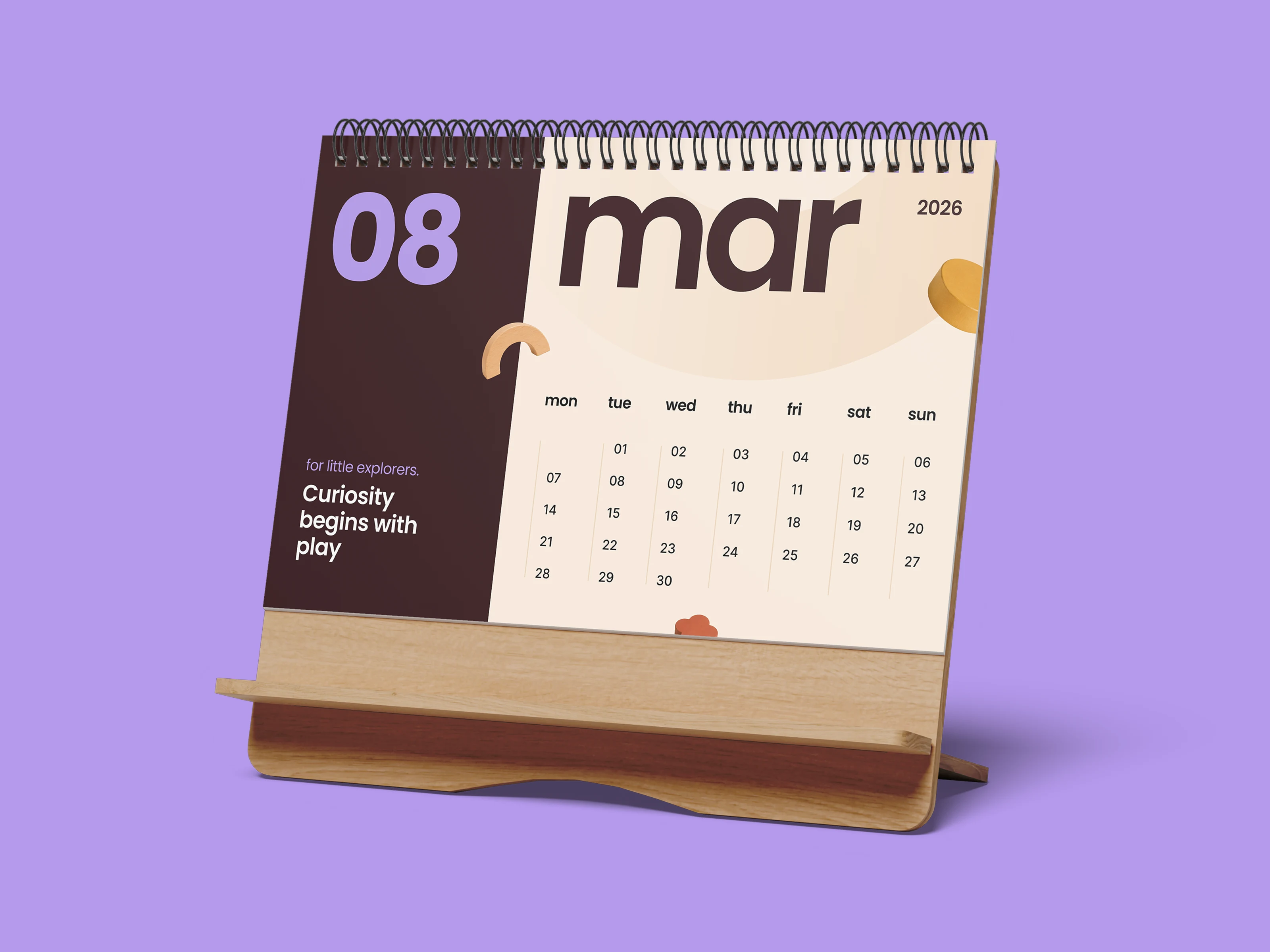
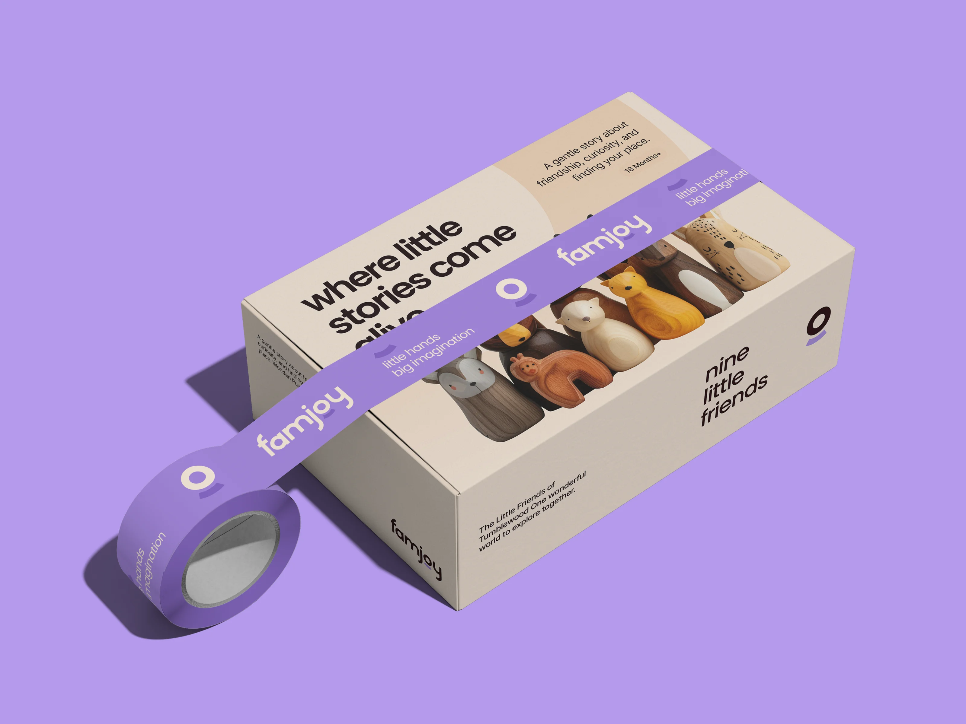
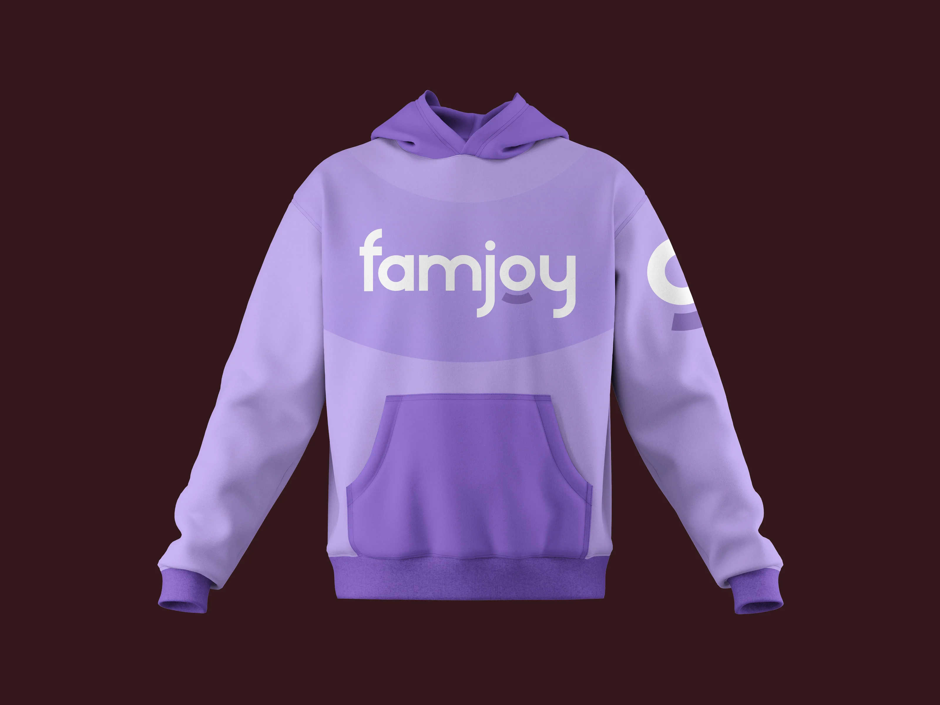
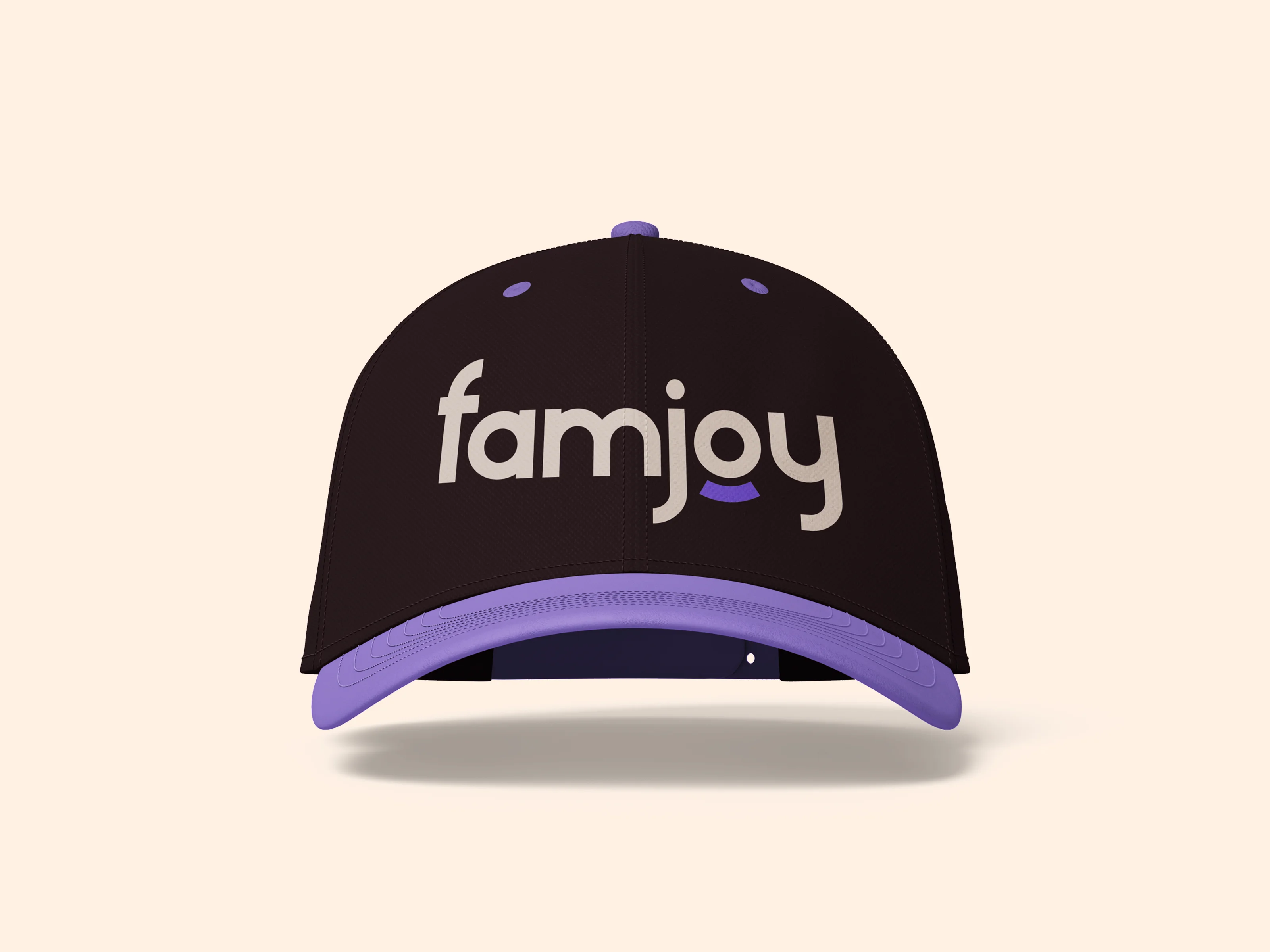
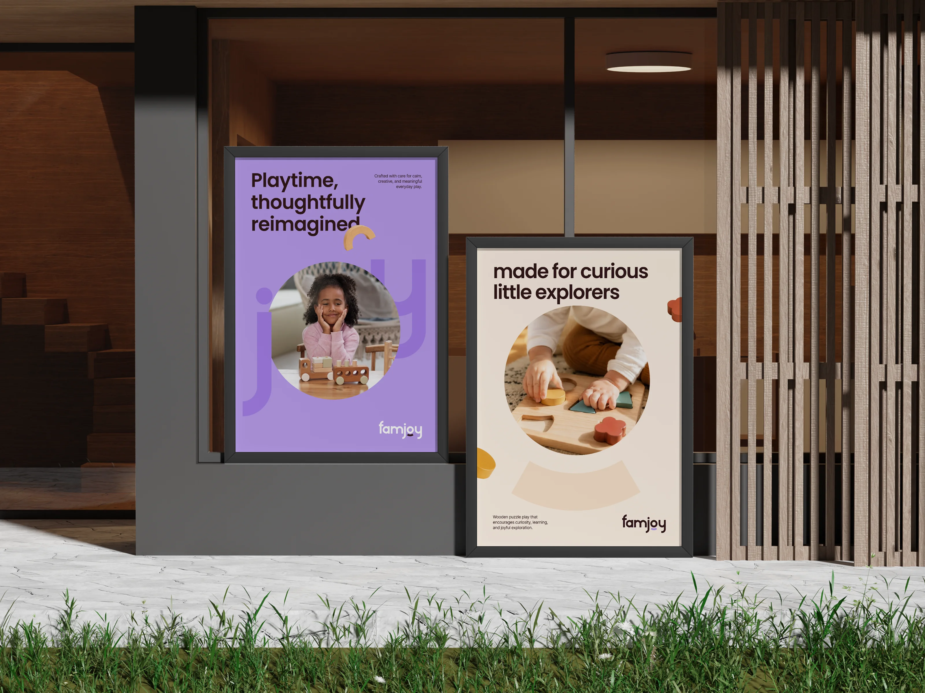
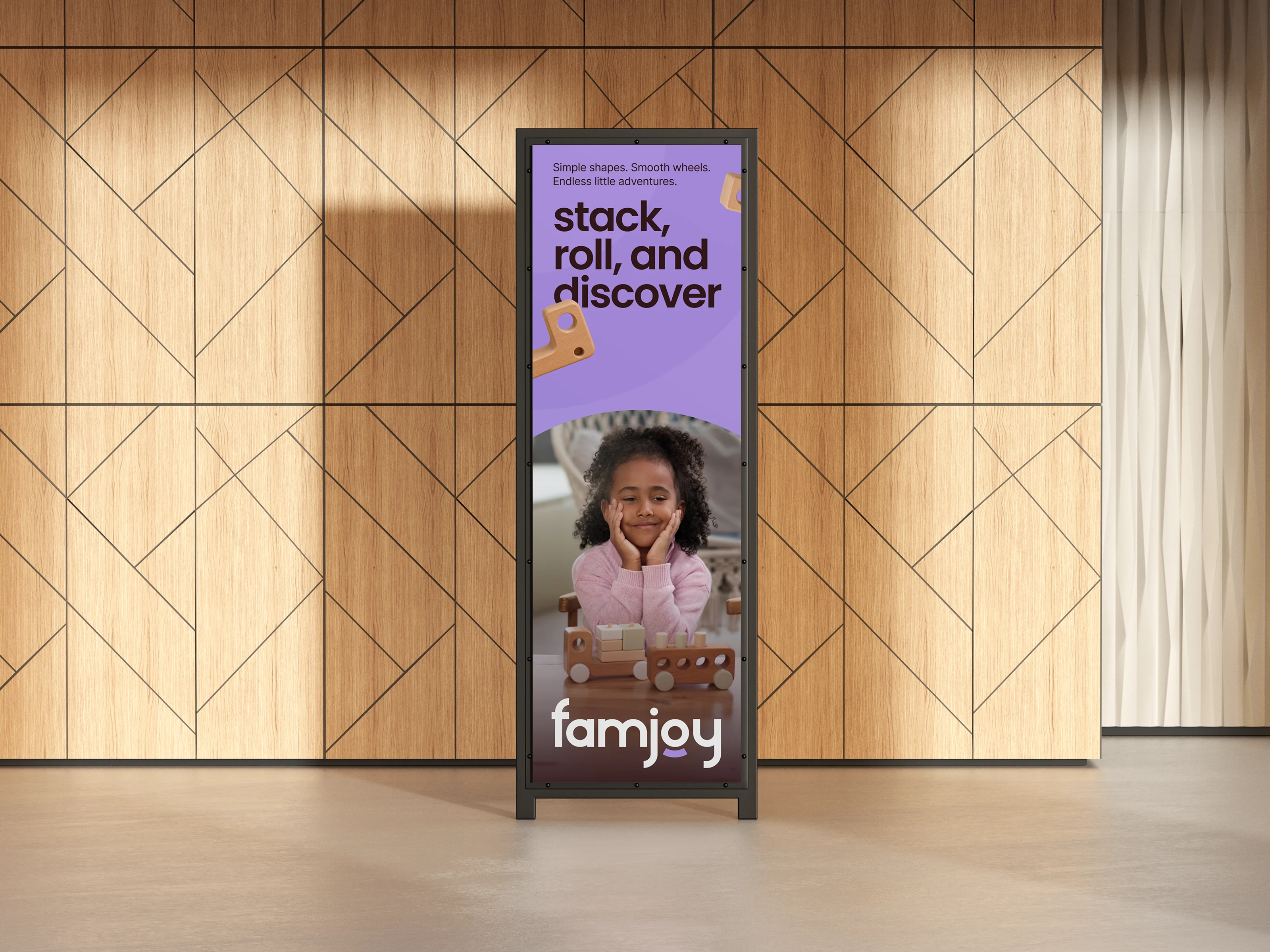
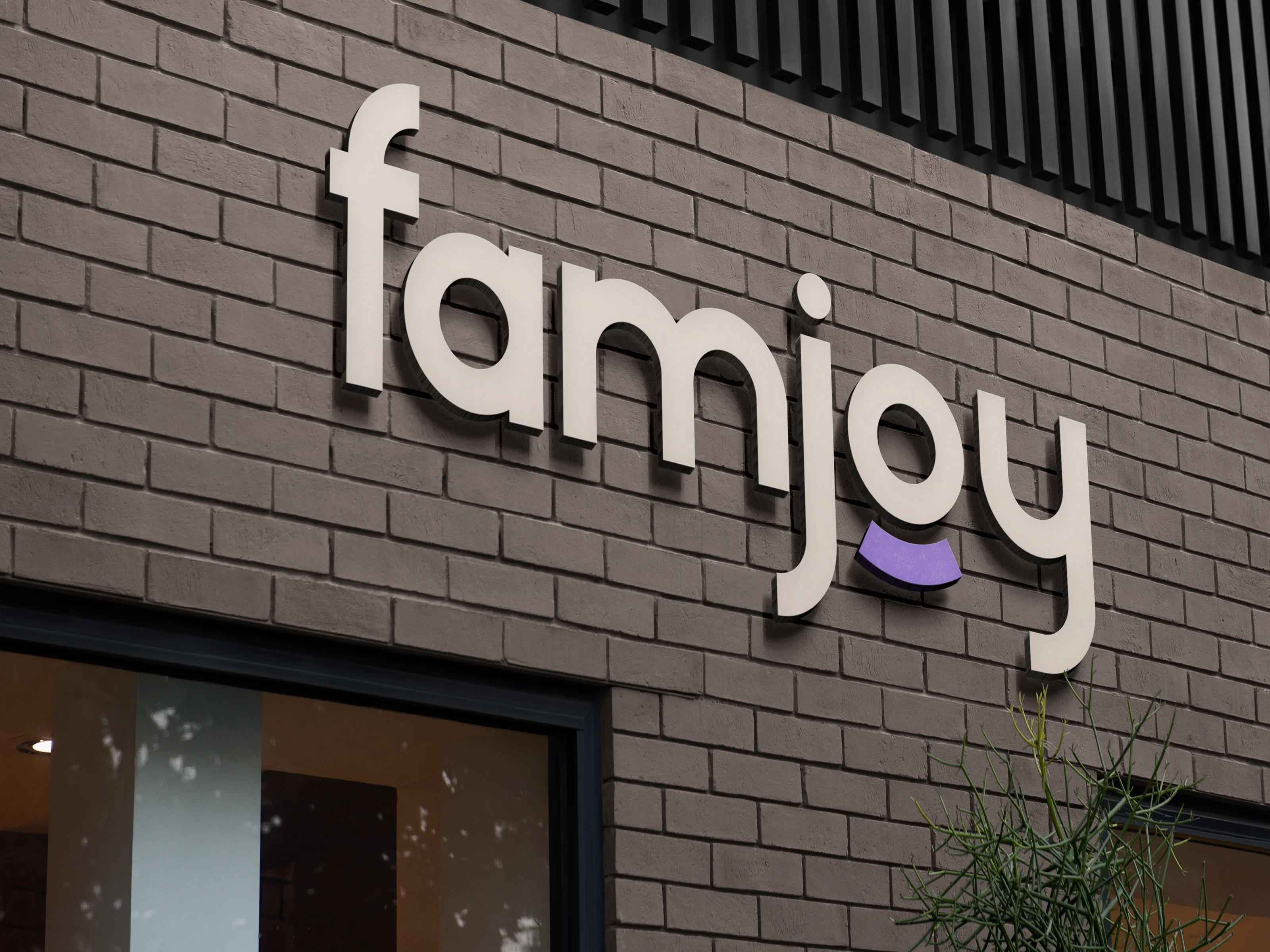
We built FamJoy as one brand world, not a set of loose pieces. From identity and color to packs, social posts, stationery, brochures, stories, and calendars, every touchpoint had to feel playful, clear, and consistent, while giving the business room to grow across more products and new markets.




( 00-02 )
CHALLENGES
The challenge was balancing play with trust. A kids’ brand had to excite children while still feeling clear and credible to parents. Every element needed flexibility across products, packs, stories, social content, and daily brand use.
We built a flexible visual system with bright colors, simple forms, warm storytelling, and clear brand cues. Instead of making one-off pieces, we set rules that could stretch across packs, campaigns, print, and digital content while keeping FamJoy easy to recognize wherever families found it.



( 00-03 )
SUMMARY
FamJoy now feels like one brand wherever families meet it. The identity is playful without being noisy, consistent without feeling repetitive, and flexible enough to support new products, packaging, campaigns, and stories as the business grows.
The result is a brand system built beyond launch day. FamJoy now has a clear visual language, reusable assets, packaging direction, and communication tools that make future work faster and more consistent, giving the business a foundation for recognition, trust, and growth.
( 00-03 )
DISCOVER MORE


